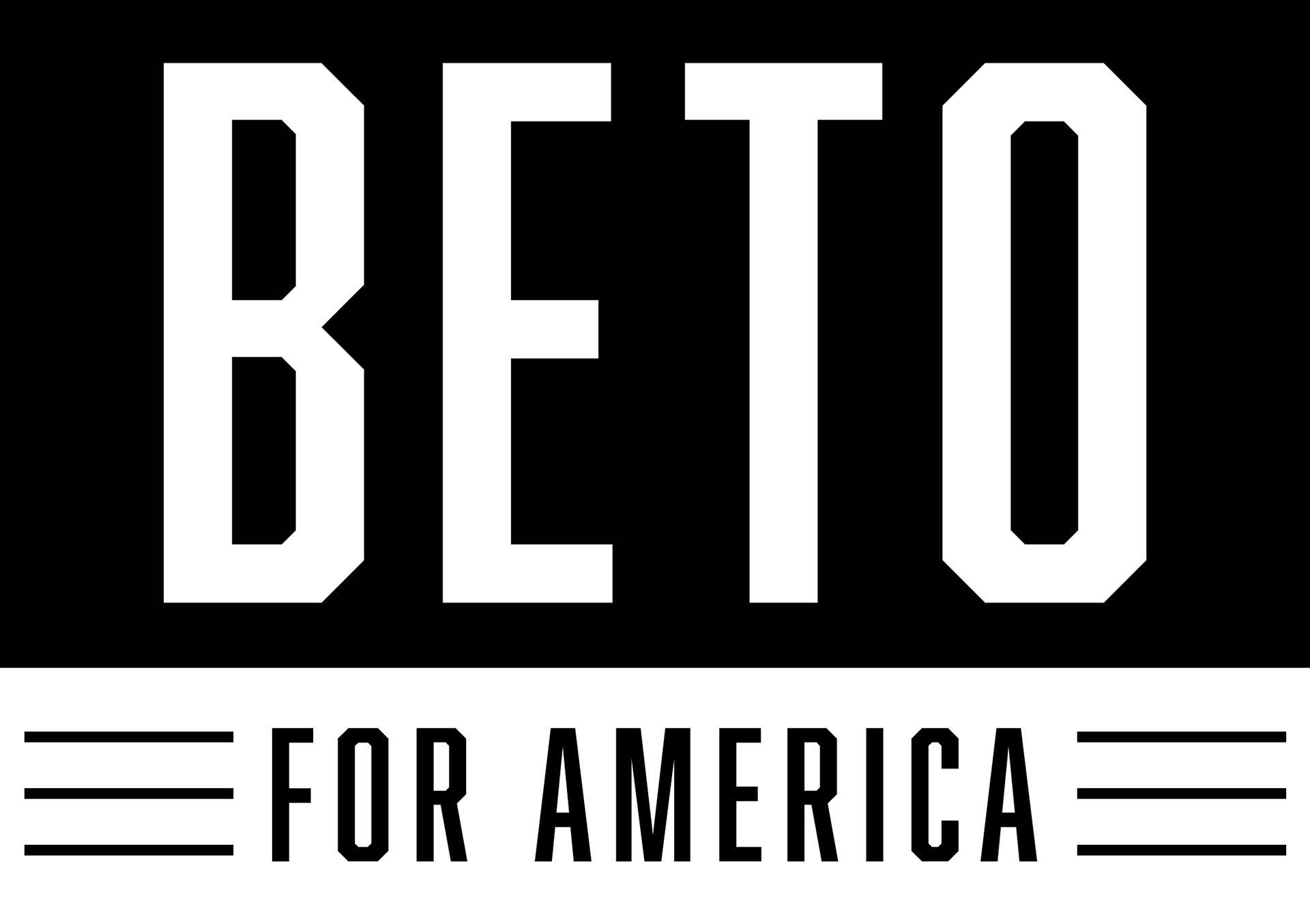
Final Logo design for the Beto For America Presidential Campaign
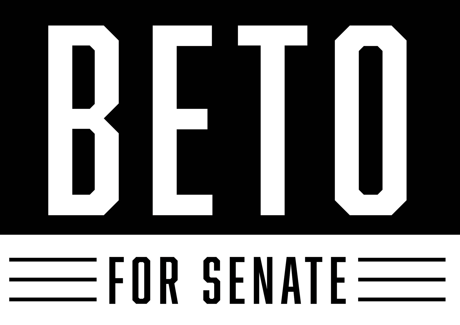
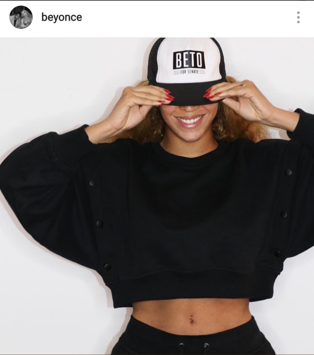
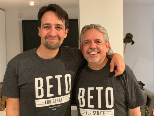
Final Logo for the Beto for Senate Campaign
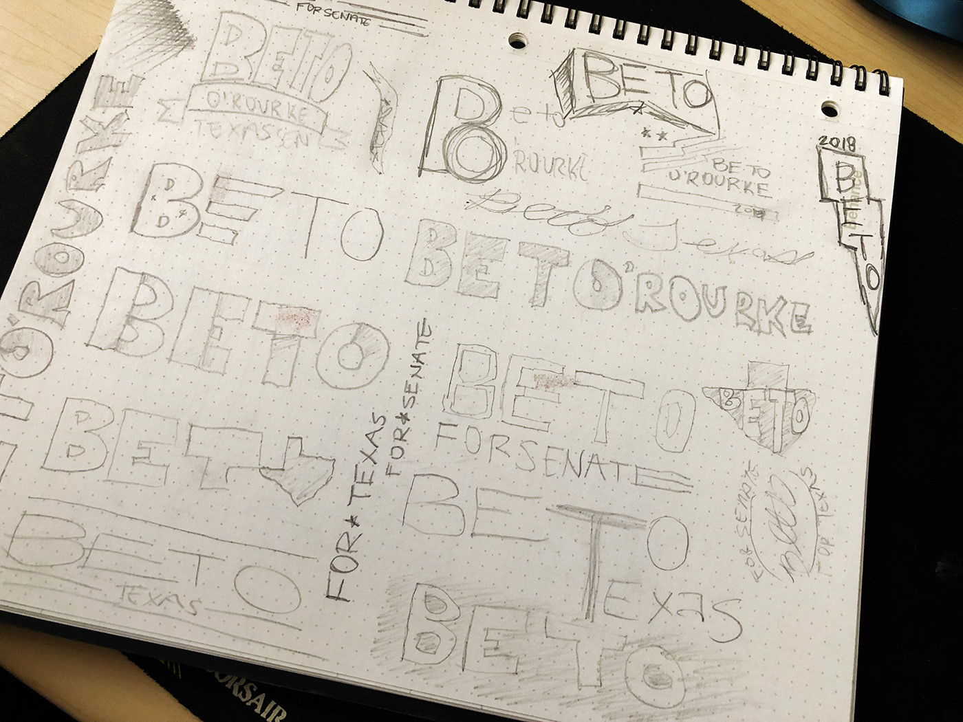
Early terrible paper/pencil sketches of logo.

Early colored sketches of logo. I was real big on the black and white. I remember showing various people the early black and white sketches and almost everyone telling me "It needs color" or "shouldn't it be red or blue?". These were the logos I presented based on the feedback I had received. In the end, I trusted my gut and showed the black and white version after these which the campaign was immediately drawn to and ultimately went with. *NOT USED IN CAMPAIGN
Check out these featured publications for insights on the Beto for Senate branding process:
Houston Chronicle - Less is more: The history behind Beto O'Rourke's political designs - March 15, 2019
LabourList (UK) - How we can learn from Beto O’Rourke’s campaign design - November 8, 2018
Dallas Morning News - Fonts and Leading on the Campaign Trail - November 4, 2018
Type Mag - Fonts and Leading on the Campaign Trail - October 27, 2018
CNN Coverline - Why midterm candidates are ditching red, white, and blue campaign logos - October 20, 2018
Austin Statesman - Political designs: How Beto’s basic black and white and Ocasio-Cortez’s revolutionary look defined their candidacies - August 29, 2018
Star Telegram Fort Worth - Why Beto’s campaign sign resembles the likeness of this Whataburger condiment - August 09, 2018